In November 2023, T-Mobile launched the the new Octopus Driver mobile app, which allows drivers to view earned points and cash out earnings from in-vehicle entertainment tablet.
As the design lead, I was responsible of revamping the 4 major workflows: dashboard, wallet, rewards and account in 8 months.
TIME
March, 2023 - Nov, 2023
SKILL
Mobile Design
Dark Mode
User Research & Testing
Project Scoping
Design Strategy
Cross-function Stakeholder Collaboration
cross-function partners
Business Growth Team
Driver Success Team
TEAM
2 designers
2 project managers
2 UAT (User Acceptance Tester)
15+ iOS and Android engineers
High Adoption Rate
The app's adoption rate exceeded the expected rate of 50%.
.png)
Increased Active Users
Active users increased by 17% after launch of the new app.
Increased Satisfaction
The Net Promoter Score (NPS) increased by 20% in the latest survey with over 40K responses.
Despite the exponential growth of the active users, the churn rate of Octopus surged from 3.8% to 9.6% over the years. The poor web app experience is one of the huge factors that contributed to the spike. Approximately 21% of users rated the web app experience as poor based on the recent survey.
How might we redesign Octopus as a mobile-first and intuitive experience to reduce churn and help drivers better manage earnings on the go?
Users valued their points, as they directly tied to earnings. However, the existing point tracking was unclear—leading to confusion and up to 20% of support tickets being related to points.
I redesigned the experience by surfacing key details like point rules and earning history, giving users more control and transparency. One of the biggest challenges was navigating a sudden pivot in product direction. Explore process below to learn how I handle it ;)
Point-related tickets went down by

.gif)
Explore Process
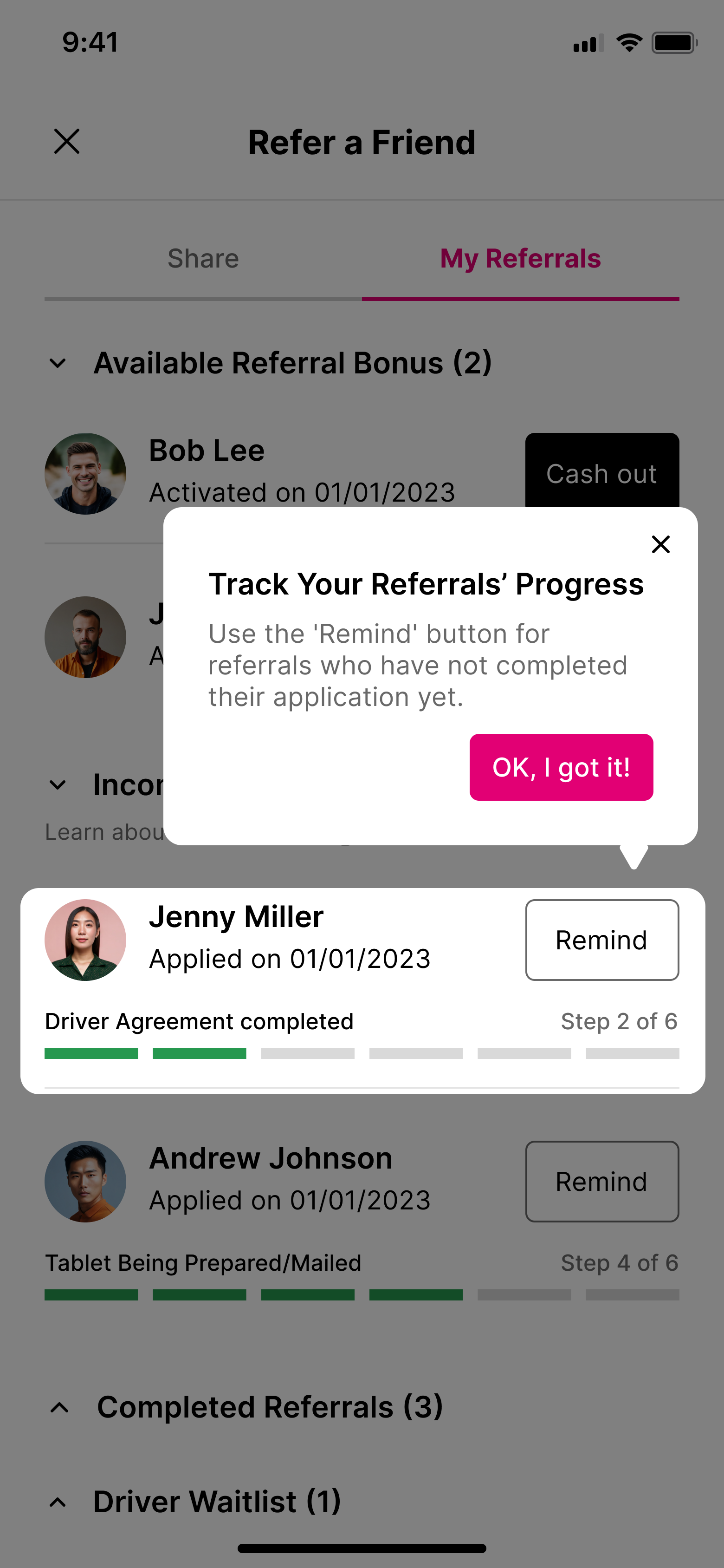
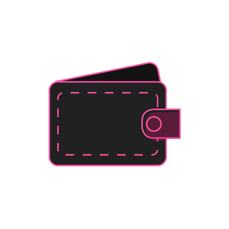
Users frequently check their earnings and cash out on the go, yet data from FullStory revealed over 500 dead clicks on the cash-out button each month.
I identified key friction points and partnered with PMs and engineers to redesign the flow. Along the way, I had to navigate a tight timeline and technical constraints. Explore the process below to see how I balanced user needs with engineering realities.
Dead click reduced by
Cash out rate went up by
Explore Process
21% of drivers struggled to sign in, often due to forgotten credentials or frequent phone number changes.
To reduce friction, I collaborated with my peer designer, engineers, PMs, and the UAT (User Acceptance Test) team to design login flows covering 8+ edge cases. Along the way, I learned the importance of involving engineers early to avoid costly back-and-forth during design process.
Log in issues tickets went down by
In Development
To foster engagement and increase event participation, we shifted from passive email announcements, which many drivers found spammy, to a more interactive in-app community space.
In Phase 1, we centralized events and contests in a dedicated hub to improve visibility. Phase 2 will introduces commenting, saving, and sharing to deepen engagement. We're aiming to drive meaningful engagement, with event attendance rate and in-app activity as key indicators of success.
🎉 Hear what our drivers are saying about the Community feature! Big kudos to my colleague Ivy Cai for representing the design team:)
Many of our drivers aren’t tech-savvy and often rely on customer support for help. In early interviews, I found that some drivers didn’t use the app simply because they didn’t know how.
Partnering with another designer, I created a contextual product tour to guide drivers through onboarding and allow them to revisit tutorials anytime.
Related support requests droped by
Completion rate of the onboarding tour
Over 8 months, I identified key user challenges and shaped solutions through iterations. The next sections walk through the research that guided my decisions—and two focused deep dives that highlight the impact.
With the project request in mind, we lacked a clear goal and understanding of the problem. Partnering with the customer success team, I interviewed 6 full-time drivers from across the U.S. to learn how they use the Octopus app and their experiences with it.

The interviews surfaced recurring frustrations, but I needed a clearer map of where the biggest usability gaps were. I collaborated with the product team, driver support and growth team to run a heuristic evaluation and define the top areas for design improvement.
Read the Full Heuristic Report

Heuristic Evaluation Insights

One of the major usability issues identified was the lack of hierarchy. I proposed to redesign the information architecture of the app. However, I received some hesitation from the business owners.
"Our drivers are NOT tech-savvy users, some of our long-term users of the app might be frustrated by the drastic changes of the app structure which might lead to higher churn rate."
To address stakeholder concerns, I grounded my proposal in user data. The heuristic evaluation revealed a lack of visual hierarchy in the navigation—a direct reflection of deeper problems in the underlying information architecture. Using FullStory and interview insights, we analyzed how users moved through the app and what tasks they prioritized. This informed our decision to restructure the navigation around their real-world workflows.


of users start their journey by cashing out earnings directly after landing on the homepage.

referrals made per year, with a significant portion of new users coming from driver-to-driver referrals.

of users struggle to understand their account status which directly impacted their ability to cash out earnings,
.png)
Redesigned Site Map
With all stakeholders on board with the new site map, I moved forward by crafting user flows. Given the scope and complexity of the redesign, I dedicated significant time collaborating with the UAT (User Acceptance Tester) team to ensure alignment between the user flow I created and the user scenarios they developed. This effort resulted in approximately 30+ user flows and 110 wireframes.

Core User Flow
With the new information architecture in place, we had a clear foundation for design. Let’s take a closer look at two key areas where I led design efforts to solve critical user pain points.

problem statement
The sign-in issue is one of the primary reasons why the product team decided to transition to native app. The team believed that enabling biometric login would alleviate the problem of users forgetting their sign-in information or being unable to access the text message because drivers switch their phone numbers frequently which is common among ride-share drivers.


The missing piece
Initially I started creating user flows of sign in, however after reviewing with the product team, I realized that the key to design a successful sign-in experience is closely related to understanding how the backend operates. Therefore I sat down with the engineering team and learned about biometric sign-in from a technical aspect.
💭 What I thought it was...

🤯 The reality is....
.png)
working agile with the team
With a deeper understanding of the technical requirements, I developed user flows that aligned with the technical work flow provided by the engineer team and then proceeded with creating wireframes. In order to move things quickly and minimize back-and-forth in the design phase, I involved engineers in the weekly sync during the early stage to ensure we are on the same page.

Final Deliverable of Sign-in
Problem Statement
Break Down the Problem
To understand why users feel frustrated with the cash-out process, I analyzed over 20 user sessions in FullStory. I discovered two main challenges that users are facing:


Confusing Cash Out Process
1. Inefficient placement of CTA
From the user sessions, I noticed users clicking on potential call to action (CTA) buttons such as "Lifetime Earnings" or "Available to Transfer" in magenta, expecting to reach the cash-out page, only to realize they are not clickable and they needed to scroll to find it. The poor placement of the CTA might cause users to spend more time cashing out.
Click Heat Map
.png)
I generated a click heat map in FullStory using data from 50,000 user interactions over the past 12 months to analyze the click rates for various CTAs.
The click rate for "Cash Out" button is relatively low, despite it being a crucial task for users to cash out their earnings. The heat map indicates that users are either distracted from the primary task or unable to locate the correct spot to cash out.
Proposed Solution


2. Lack of feedback
Fullstory data shows 13% rage clicks on cash out buttons in 30 days. The initially disabled buttons make the interface seem broken, and the lack of feedback after clicks adds to user frustration.

Proposed Solution
two types of earnings
Regular VS. Gift card only earnings

Another factor contributing to the high rage clicks on cash out buttons might be the complicated logic between earnings that can be cashed out to both a bank account and a gift card versus those limited to a gift card. The key challenge is to better explain the differences between the two without confusion.
After multiple iterations and design reviews within the design team, I finalized 2 design options. Here is the evolution of my final design tackling this challenge:
Evolution of the design


👍 The separate cash out flows clearly differentiate between the 2 types of earnings
👍 A "Cash all" option will be feasible since there are no restrictions on selection
❌ 2 different interfaces might be confusing
❌ Users might miss the other tab and rarely click on it
❌ More time needed from both engineering team to implement

👍 Only 1 interface for both types of earnings
👍 Clear alert message when users can't proceed when cashing out
❌ Users have to cash out through trial and error, selecting earnings and clicking cash out only to see an error message
.png)
✅ Clearly stated what earnings can or can not be selected to prevent errors
✅ Easier to implement within the time constrains
🎯 The design was implemented in the final launch.
With more time and technical flexibility,
how could I further improve the cash out process?
The constrain we had to deal with
.png)
problem statement
Pain Points
Points serve as the primary metric for drivers to track their earnings. However, based on user interviews and past driver satisfaction survey results, I discovered that many drivers struggle with understanding the point system. Combining with the result from heuristic evaluation, I identified two main pain points:
"How do points work? "
Many drivers are confused about how the points system works, despite receiving onboarding instructions. The info bubble in the point tracker explains it but has a click rate of less than 1%.
"I need to check if my points have been updated"
Drivers need to regularly check their points to ensure the system updates them correctly. However, the current design requires multiple clicks to view historical points, making it inconvenient.
Surface the information
The solution focuses on surfacing the information drivers care about and making it more accessible. Here are the 2 changes I made:
1. Surface the point rules and make it less text-heavy.
2. Have the historical point accessible on the tracker.
New challenge emerged
Throughout the project, business requirements evolved, and a new design challenge emerged. Initially, new drivers would receive their $25 bonus upon account activation, but the business team later decided that drivers must earn 50 points to qualify for the $25 new driver bonus to motivate users to start actively driving with the Octopus tablet.
How do I integrate the new point rules to the point tracker while maintaining the user engagement?
I brainstormed several logics with the product team and here are some of my explorations:
V1 - Two Trackers

V2- Dynamic
FINAL - Milestone

👎 Two different point trackers are hard to keep track of
👎 Users need to think about how this works
👎 Take up too much space on the app
👎 Not clear on the difference between bonus and regular points.
👎 Changing the total points frequently makes the interface more complex and harder to understand.
✅ The bonus concept is well integrated in the point system.
✅ More scalable, allowing future events and bonuses to be part of the milestone.
Another important reason for choosing the 'Milestone' design is its seamless integration with the current rewards system. The product already offers a gamified experience to motivate users to drive with the tablet, such as achievement badges, leaderboards, and more. Incorporating the concept of a 'New Driver Gift Box' into this experience further enhances the gamified approach.
This was really exciting and fun project to work on and it was the first project I Iead from the beginning to launch from UX stand point. Some main takeaways from the project:
Involve development team as early as possible
In the first sprint, delaying developer involvement caused a mismatch between user flow and implementation. In later sprints, I engaged developers earlier to streamline design decisions.
Always fight for good UX
With the tight release schedule and technical constrains, I still fought for what I believe is important for user experience.
Prioritize what truly matters
With many UX issues to address and a tight timeline, I focused on what mattered most to users, leaving 'nice-to-haves' for future releases.
.png)